


Designing a Responsive User Experience for Social Good
Project Details
Sector: Politics & Government
Challenge: To design a responsive experience that helps community members understand proposed bills by congress and how it affects their communities.
My Role: Lead UX/UI Designer, UX Researcher, UX Strategist, UX Writer, Interaction Designer
Responsibilities: Conducting interviews, paper and digital wireframing, low and high-fidelity prototyping, conducting usability studies, and iterating on designs.
Project Duration: 3 months - (January 2023 - March 2023)
The Design Process

I. Defining the Problem
As part of the Google UX Design Certification, we were tasked with choosing a randomly generated UX design challenge from https://sharpen.design/. My challenge was to design a responsive experience that helps people understand proposed bills by congress and how it affects their communities. To do this, I had to first make sure I understood the needs of the people.
II. Empathize
To better understand the pain points of people, I interviewed 10 people (roughly between the ages of 23 to 48) to ask them about their experience with engaging in politics.
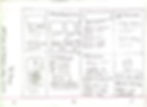
Interview Results

There were three common themes that came up during these interviews, as shown in the above image. From these themes, I created two personas that represent the type of people that would use this experience the most.
Personas


There were three common themes that came up during these interviews, as shown in the above image. From these themes, I created two personas that represent the type of people that would use this experience the most. At this point, I was ready to start generating ideas to address these user needs.
III. Ideate
Crazy 8's
Analysis
Crazy 8's is an ideation technique where a designer creates a 2X4 or 4X2 grid and creates eight (8) ideas in eight (8) minutes or less. For mine, I liked the idea of having a "Proposed Bills" and "Recently Passed Bills" section for users so that they can quickly see bills that have moved in Congress. I also liked the idea of including congressmen/women ratings based on if they actually have the best interests of their constituents in mind or if they're only in it to enrich themselves because one of the frustrations of the personas was that the government is basically corrupt because it panders the the rich and powerful due to practices like lobbying.
Paper Wireframes


Digital Wireframes


Analysis
In the paper sketches, I experimented with different layouts for representing the various elements and what a basic flow would look like in an experience that helps one understand how proposed bills in congress impact your community (NOTE: to view the different screen sizes, click the Figma logo on the top left and navigate from there).
IV. Test (Round 1/2)
I conducted a moderated usability study to test of five (5) participants the initial digital wireframes to understand if the proposed solution would meet user needs.
Methodology: Moderated usability study conducted and recorded over Zoom, Google Meet, or other video calling platform.
KPIs: Qualitative data - quotes from usability study to gauge how users perceive and interact with the proposed solution, Drop Off Rates, Time on Task
Research Questions: Can users effectively and efficiently discover how proposed bills by Congress will impact their communities? How might non native English speakers interact with the proposed solution? Will they find it difficult to navigate? How might we help those who are skeptical or mistrustful of big government better understand the law passing process?
Initial User Feedback

Affinity Diagram - Themes

Analysis
In the initial feedback, there were six (6) themes or patterns that arose from the research. Users thought it would be best to give users the option to CHOOSE between light and dark mode, giving users more control over their viewing experience in different lighting environments. It was also important to add search functionality so that users may find the information they seek more quickly. It was difficult for users to find the notifications icon because it was represented with a placeholder. In higher fidelity wireframes and mockups, this will be alleviated because the placeholder will be replaced with an actual notifications icon.
Usability Study Findings
.jpg)
KPIs

Tasks
1 - Enter and search for your town and state to see what bills are being passed in your area.
2 - Access the proposed bills you’re interested in reading about later by clicking on your “Bulletin.”
3 - Click on a rep/senator to learn more about them.
4 - Check your notifications to see what bills are going to be passed.
5 - Click on a bill to see how it’ll affect your community.
Analysis
The above graph shows the average time spent on each task for all five (5) participants in seconds. With these usability findings in mind, it was now time to iterate on these designs.

Analysis
During the first usability study, 60% of participants reported difficulty completing task four (4): to find the notifications icon to check which bills are being passed.
V. Developing from Wireframes (Round 1/2)
Design System

I chose a color scheme that was simple but yet conveyed a sense of urgency. So, I chose the bright red (#FF2F2F) as the main accent color because I know, at least in the West, red symbolizes power, excitement, authority, and importance.
Mockups


I changed the hero image to a stock image that represents the title of a sample bill and placeholder text to represent an actual bill. I also applied the color scheme and call to action (CTAs) buttons to both, the light and dark modes of the designs. I removed the ratings from the representative/senator profile cards because they were too crowded when I added actual text biographies for each congressman/woman. The representative/senator ratings will be present when users click on each individual representative/senator profile. I also added a search functionality to help users better find representative/senator and bills that they're looking for.
VI. Test (2/2)
I conducted a second moderated usability study using the same methodology to further improve upon the designs. I also added a 6th task, which was for users to return to the landing page by logging out here are the results:
.jpg)
KPIs
.jpg)

Adding the actual notification icon helped users complete task four (4), resulting in a 86% decrease in average time on task. I used five (5) different participants for the second usability study, which explains differences in other averages for time on task.
VII. Develop: Iterating After 2nd Usability Test
During my second usability test, I used the findings to iterate on the mockups I previously made. Here are the findings from the second usability test:
Mockups
.png)
For the second iteration of designs, I added the option for users to select their preferred language. I also changed the location search bar so that it prompts users for their town or city and their state.
High-Fidelity Prototype
Click "VIEW PROTOTYPE" to run the simulated designs in Figma (NOTE: to view the different screen sizes, click the Figma logo on the top left and navigate from there).

VIII. Accessibility Considerations
In consideration for those who are non native English speakers, I have included different language options. I also gave users the option to CHOOSE between light/dark mode depending on different lighting environments. For example, users who are on the go, using the website during a bright sunny day would use light mode, while users would use dark mode inside so that the bright light isn't as strenuous on the eyes. I have also chosen a simple color scheme that provides contrast between the visual elements and the background.
.png)
IX. Next Steps
.png)
Impact:
The website achieves the goals of helping users discover proposed bills by congress efficiently and effectively. Users can complete the entire user flow in under a minute! One quote from peer feedback:
“I'm still skeptical of big government but at least I have a better understand of how laws are actually passed in congress."
What I learned:
I learned to apply the Crazy 8's ideation technique for rapidly generating potential solutions.
Going forward:
The next steps are to iterate on the designs based on feedback from a third round of user studies and continue to conduct more user research to determine any new features to add/remove.

