


Designing a Simple
Mobile App
For a Design Studio
Project Details
Sector: Education
Challenge: To design a simple mobile app for a design studio
My Role: Lead UX/UI Designer, UX Researcher, UX Strategist, UX Writer, Interaction Designer
Responsibilities: Conducting interviews, paper and digital wireframing, low and high-fidelity prototyping, conducting usability studies, and iterating on designs.
Project Duration: 5 months - (August 2022 - December 2022)
The Design Process

I. Defining the Problem
As part of the Google UX Design Certification, we were tasked with choosing a randomly generated UX design challenge from https://sharpen.design/. My challenge was to design a simple mobile for a design studio. I chose to model my designs after my alma mater's (Bucknell University) three design spaces on campus: 7th St. Studio & Makerspace, Maker-E, and Mooney Labs. The purpose the app is to improve everyone's experience using the three design spaces in the Bucknell community, not just students. Click the "LEARN MORE" button for more information on Bucknell's design spaces on campus.
II. Empathizing with Members of the Bucknell Community
To better understand the pain points of members of the Bucknell community, I reached out to them so that I can ask them firsthand! I asked 10 people (5 students, 3 faculty, and 2 local community members about their experience using the design spaces on campus.
Empathy Map

Analysis
This empathy map encompasses the perspective of the types of users in general. In this map, the term "They" represents members in the Bucknell Community (students, faculty, and local residents) in the Lewisburg, PA area. Though not comprehensive, the key things to note are the pain points:

Analysis
So, with these pain points in mind, I started designing using pencil and paper to formulate some early concepts.
III. Ideate
Paper Wireframes


Digital Wireframes


Low-Fidelity Prototype

Analysis
As the initial design phase continued, I made sure to base screen designs on feedback and findings from the user research. I included the profile section for users to be able to see and manage their posts as well. They’ll also be able to see upcoming events, classes, and machines reservations.
IV. Test (Round 1/2)
Affinity Diagram
_edited.jpg)
_edited.jpg)
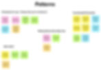
In this Affinity Diagram, I first grouped observations by participant. then I organized their observations by common themes. I grouped their observations into 4 categories: App Layout, Making Reservations/Sign Ups, App Navigation, and Functionality/Practicality.
Usability Study Findings
I conducted two rounds of usability studies. Findings from the first study helped guide the designs from wireframes to mockups. Here's a quick synopsis of the findings from the first round of usability tests.
_edited.jpg)
KPIs
.jpg)
Tasks
1 - Pull up the BOSS Laser Cutter tutorial.
2 - Reserve a date and time to use the BOSS Laser Cutter at 7th St. makerspace.
3 - Sign up for a ceramics class at 7th St. makerspace.
4 - Sign up for the custom t-shirt event at 7th St. makerspace.
5 - Check your profile to see what machine reservation/classes/events you have coming up.
Analysis
The column graph above shows the average amount of errors made from the first round of usability studies for each task. Many of the errors that users made were due to the fact that the call to action buttons were not obvious and clear enough for participants to easily find.
V. Developing from Wireframes (Round 1/2)
Design System


I chose a color scheme that had a mixture of warm and cool colors. I wanted something that was eye catching. So I chose varying shades of coral. I chose cool accent colors that are shades of teal and sea foam green to compliment the warm colors and bring a sense of tranquility and balance to the designs. I made the titles Kumbh Sans because it gave the app a sleek, minimal, modern look and feel. I made the larger titles dark teal and sea foam because I wanted to reserve the brightest red color for the call to action buttons, while still adding color and character to the designs.
Mockups

.png)
I added a carousel for each design space and a makerspace video that provides more background and context for those who aren’t as familiar with Bucknell’s Design spaces on campus. I chose to add a “Calendar” tab on the profiles for users to check upcoming events/classes/reservations. I’ve also removed elements, such as lines and buttons, which made the over UI more sleek and refined.
VI. Test (2/2)
During my second usability test, I used the findings to iterate on the mockups I previously made. Here are the findings from the second usability test:

KPIs

Analysis
I've iterated on the designs and user flow based on the feedback from the first usability test. For the second test, I've made key call to actions and common user tasks more obvious for users. As a result, user error rates have been reduced to 0%. The Bucknell Makers is error free!
VII. Develop: Iterating After 2nd Usability Test
Mockups


I added the option for users to save posts/events/classes/and tutorials that they’re interested in checking out later. I replaced the BOSS laser image with a less colorful image of the boss laser cutter and used a drop shadow inside of the image to made it look “3D” and to avoid the button being hard to find by just looking at the photo. I also added the option for users to view tutorials, events, and classes straight from the home screen, which reduces the amount of clicking through to find things. The “final” high-fidelity presented cleaner user flows for registering for events/classes and making machine reservations.
High-Fidelity Prototype

Click "VIEW PROTOTYPE" to run the simulated designs in Figma.
VIII. Accessibility Considerations
In consideration for those with visual impairments, I have made sure to use large iconography and graphic imagery to ensure the app is as easy as possible to navigate and understand. I also chose a color scheme that works well with most forms of colorblindness. In the gallery below, I have the title of the form of colorblindness in the center, while the chosen color scheme above and how each color is perceived by the kind of colorblindness in the title. I deduce that the chosen color scheme could be improved for those with protanopia, deuteranopia (because the "red-most" colors (ED706G & FF5757) look too similar in contrast/brightness), and achromatopsia (because the shades of grey are not high contrast enough to differentiate between them). See the gallery below:


IX. Next Steps
Impact:
The app makes users feel like their concerns heard. One quote from peer feedback:
“The app made it so easy to reserve a machine! I would definitely use this app as a go-to for end of semester projects, especially when the design spaces get crowded.”
What I learned:
I learned the importance of making every design decision based on user research as much as possible. Sometimes, as designers we may want to design something in a way that “looks cool” but ends up hurting the user experience overall. I also learned that a design is never truly "done." There's always something to be done to improve the user experience of a digital product!
Going forward:
The next steps are to iterate on the designs based on feedback from a third round of user studies, continue to conduct more user research to determine any new features to add/remove, and collaborate with Bucknell University IT team and/or Computer Science Department to actually build the app for the Bucknell Community to use. I would also change the chosen color scheme so that it's more accessible to those with varying forms of color blindness (protanopia, deuteranopia, and achromatopsia).
